
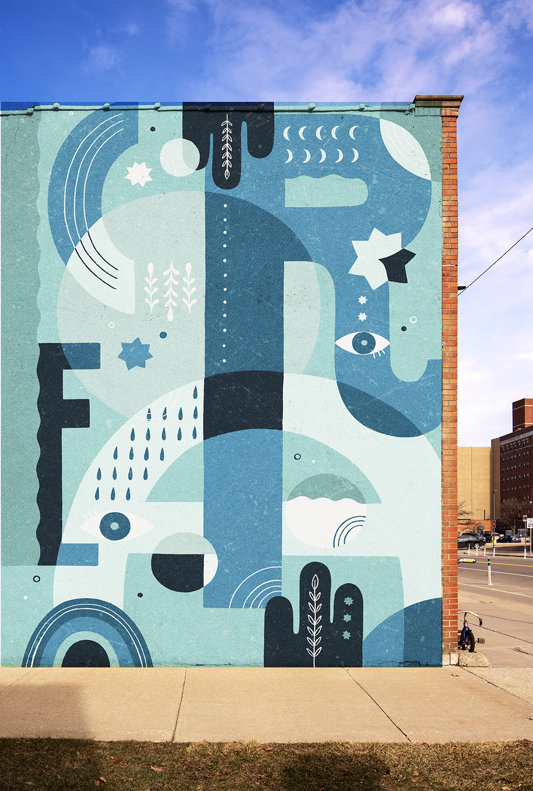
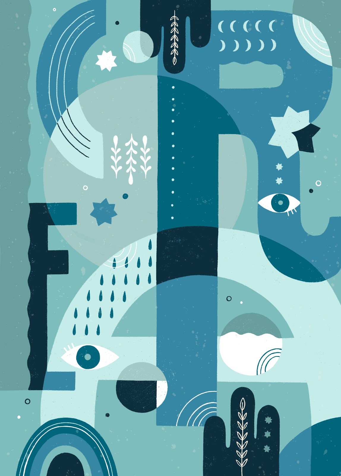
A self initiated mural design inspired by the words ‘CREA’ (“create” in english).
I wanted to test the possibilities of illustrating a single word by superimposing letters and elements. I began with the 4 letters at a considerable thickness to be able to add enough illustration within the letters themselves.
In addition, in this case I worked on the repetition of shapes by creating a kind of pattern (with moons, lines, drops…) that could fill the entire width of the stroke of a letter.
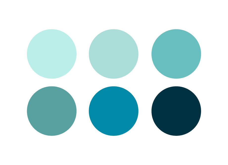
Color palette:
With so many small overlapping elements, the colour selection had to be quite monochromatic. I chose various shades of blue to create a mood.
This is the final result:
Mural application: (mockup):