

Personal project that consisted of making 2 illustrations to be used as packaging for 2 of its flavours: pineapple and watermelon.
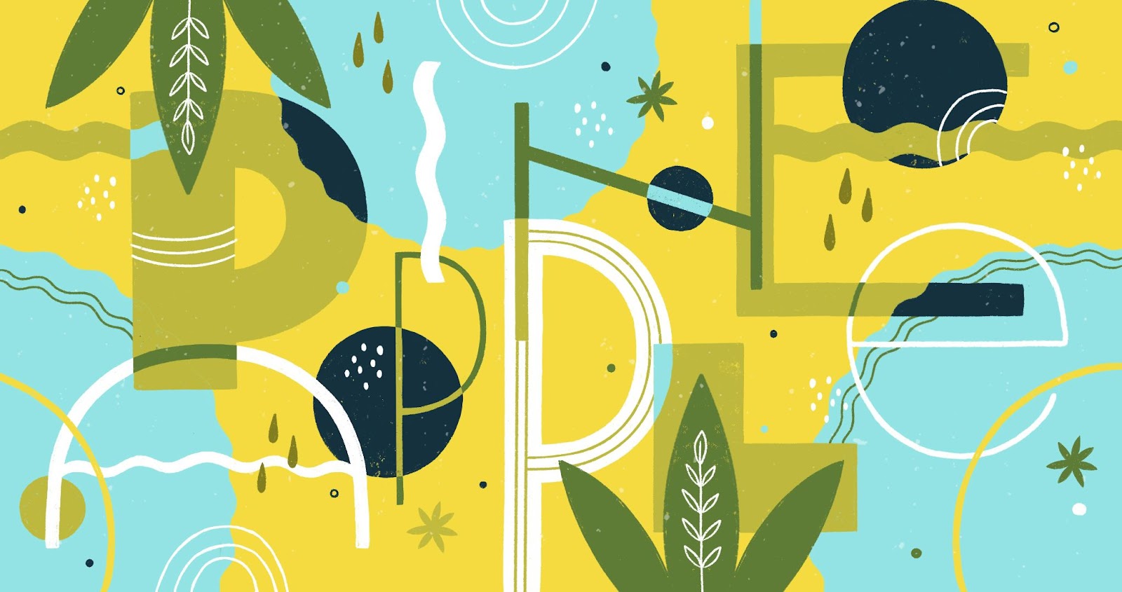
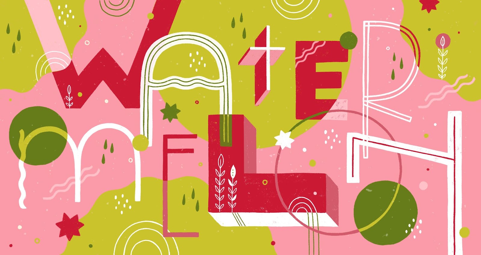
The challenge of this project was the format of the can itself (visible in loose parts). For this, I decided to make an abstract pattern combining the letters of the flavours (PINEAPPLE and WATERMELON) with elements related to the fruit in question.
Instead of using realistic elements (like the pineapple itself, for example) I felt more comfortable expanding these into masses that evoke the fruit but are not so clearly visible.
I used circular masses with waves of different shapes (representing the fruit cut crosswise), and pineapple leaves / watermelon seeds in each case.
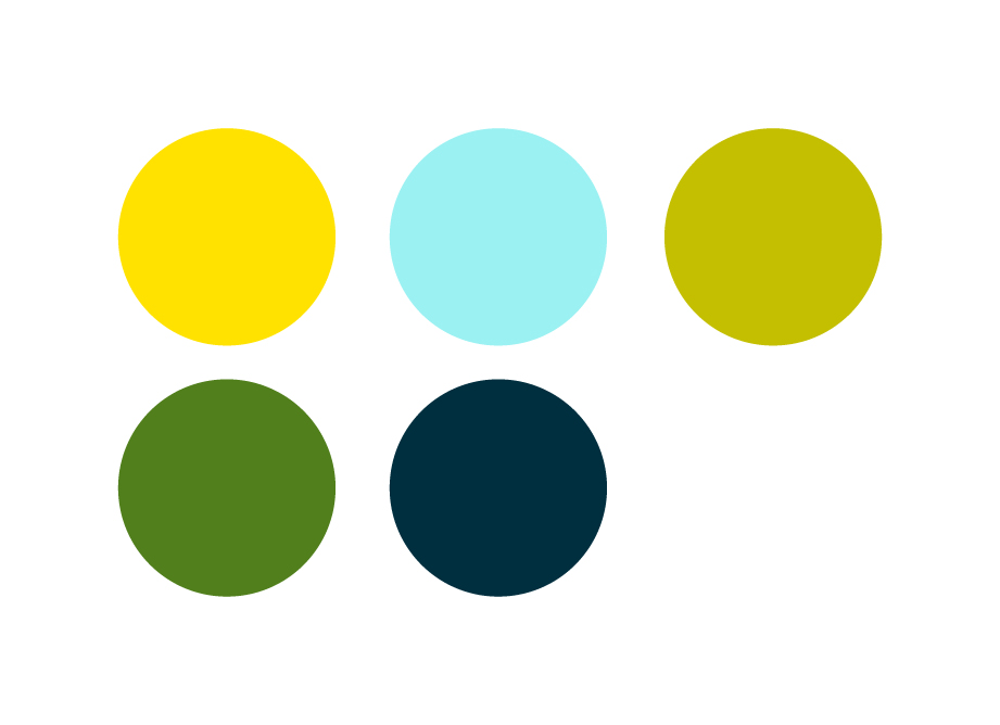
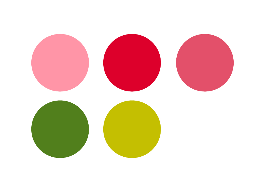
Colour palette:
In both cases, the chosen colour palette would support the concept of the illustration and make the taste of each of the beverages more understandable.
Final result:
Can label application:

